


Mobile App Navigation: Top 12 UI Elements For App Navigation Patterns

Holding an app without knowing what features and functionalities it has, is the first experience after downloading. Users have to map out where they should click or go by seeing the UI design of the app. UI UX design plays a vital role in navigating the mobile app in an understandable way. Once UI UX designers create mobile app wireframes, they have to be very careful about all the next steps of each option.
Exceptional mobile app navigation gives an exceptional user experience while using the app. If you fail to streamline the mobile app navigation, the end result will not be the same as you expect. It is all about how you guide your users to use your app.
The concept of mobile app navigation is simply depicted as a road without a roadmap. What if you and your friends go on a road trip without having a map? They just need guidance in any form, such as a guide wh already visited their famous places or a map where they can navigate to their next destination.
For mobile app navigation, we can turn this example into the best. Let’s get the in-depth psychology behind the mobile app navigation process.
Mobile App Navigation – Why it makes app outperform
The term navigation simply defines how actions are performed to reach one point to another. Mobile app navigation helps to jump over further steps of completing users’ desired points. Let’s say a user visits an eCommerce mobile app to purchase a pair of jeans.
The flow of the app must be streamlined till the checkout window. First, the user may visit product pages to see a few good options, and then he may zoom out or zoom in on products and read the product description. Once he makes the decisions, he goes to add to the cart and then proceeds to checkouts.
See! It’s that simple. The navigation helps achieve the quick and end point without roadblocks. What if you navigate them to other pages that are not worth it? He must let the app uninstall because of its complex UI UX design and mobile app navigation.
Mobile app design must be smooth, user-friendly, and coherent when it comes to providing user engagement. Right after planning the app features, UI UX designers must focus on how features should be navigated rationally. Professional designers, you can meet over MMCGBL, and also a purposeful portfolio is waiting to see you.
The Importance Of Building Right Navigation
Right mobile app navigation signifies the authentic user experience. If your mobile app runs on Android or iOS or is a cross-app platform, the UI UX design experience must be lucid for your user.
The trend of building mobile-first website design also represents the importance of mobile usage. Companies encouraging websites or web apps also need eloquent navigation. No matter if it is a mobile app, web app, or website, providing a user-friendly UI UX experience by streamlining navigation workflow is absolutely necessary.
Read More: Web Development Trends For Your Business Website That Roll Out in 2022
Now that this idea has been considered let’s go into more detail about the value of mobile app navigation.
Navigation Helps To Explore Number Of Features
Users may access all of the crucial features of the mobile app through navigation. You have worked hard the entire time to develop an application that benefits your TG. It would be like adding salt to a wound if your users were not using all the essential features of your software.
Your users need a road that takes them in the right direction at all times, but that path itself needs to appear enticing enough to convince them to follow it! Navigation correctly makes this possible.
Great Engagement Receiving With Great UI UX Experience
The first step in navigating users according to your standards is to meet their expectations. How else would you persuade consumers to view what you have developed for them if you need them to?
Of course, a user-friendly app interface will function perfectly for you. It directs users to areas of the app where they can discover the content of interest. Their use of the app has increased as a result.
Easy To Determine Mobile App Features
Your application’s niche must be executed in such a way that it instantly grabs users’ attention. How do you go about that?
Navigation assumes responsibility for efficiently implementing your application’s specialization. Users will learn what you are most adept at in this way. However, you must decide on the navigation layout after determining your app’s category and target market.
12 UI Elements Of Mobile App Navigation Patterns
The navigation is the roadmap that allocates the users in the right action instead of getting lost. To navigate users, the UI UX designers must add a list of features and options where they can explore the most of it. A few of the elements for designing mobile app navigation patterns are mentioned below:
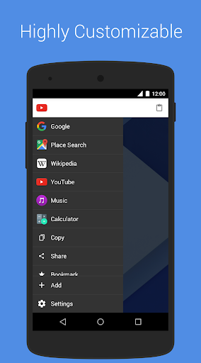
Hamburger Navigation
The top right or left corner is always dedicated to hamburger navigation for any mobile app or website. It is not new but a frequently used element for designers in their projects.
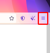
Although, it is one of the most disputable elements because few designers love its use, and some are very against this element. Over the years, the hamburger menu has drawn a lot of criticism, some of it justified and some not. The fact that it is widely used across various apps is one factor in its criticism.
However, if we examine the reasoning behind the hamburger navigation’s design, those three small lines in the page’s corner can be quite helpful without detracting from the overall aesthetic of the design.
The hamburger menu is a great idea for UI/UX designers because it allows users to use the rest of the screen space while allowing for comprehensive navigation between just those three lines.
Furthermore, the consumers are already familiar with the structure of this design; it is not a novel idea in mobile app design. Therefore, you may anticipate consumers to click on your CTA.
Full-Screen Navigation Bar
When every other mobile app navigation pattern talks about lesser space, Full-screen comes up with the opposite concept. Till now, we have studied navigation patterns that need less space, are light-weight, or have other characteristics, but full-screen navigation patterns need a complete screen as a navbar.
It may be rare, but it is the best option if you want to make your UI futuristic. Although an informative app can be used as it has a larger space on the screen, the content would be easily showcased and provide a better reading experience overall.
Card Navigation Pattern
Card navigation gives a comprehensive look at mobile apps. With the little content and graphics, you can make it more emphasized with the screen size. Moreover, these card navigation can deliver a customized and personalized experience by modeling different sizes, fonts, and images. This type of card navigation is mainly used in gaming apps that often create engagements.
Users do require material in the form of instructions to learn more about the software and its capabilities, as you can see. Cards are ideal in this situation for aggregating discrete types of information into a tailored representation of the material.
Top Navigation Bar
The top navigation bar is the simpler, eye-catching, and very obvious location that anyone can navigate while using a mobile app. Users enjoy using apps and create more engagement when they find the easiest way to jump over quick options.
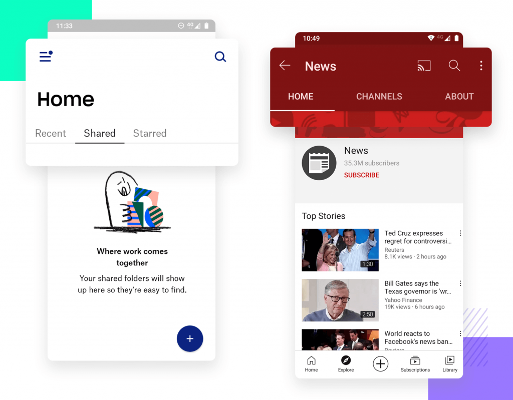
The other navigation is typically used with the top navigation. With the aid of another navigation pattern, you can make it appear aesthetically pleasing while also hinting to consumers what the important items are to be referred to beforehand.
Read More: Mobile App UI UX Design: Trends for 2022
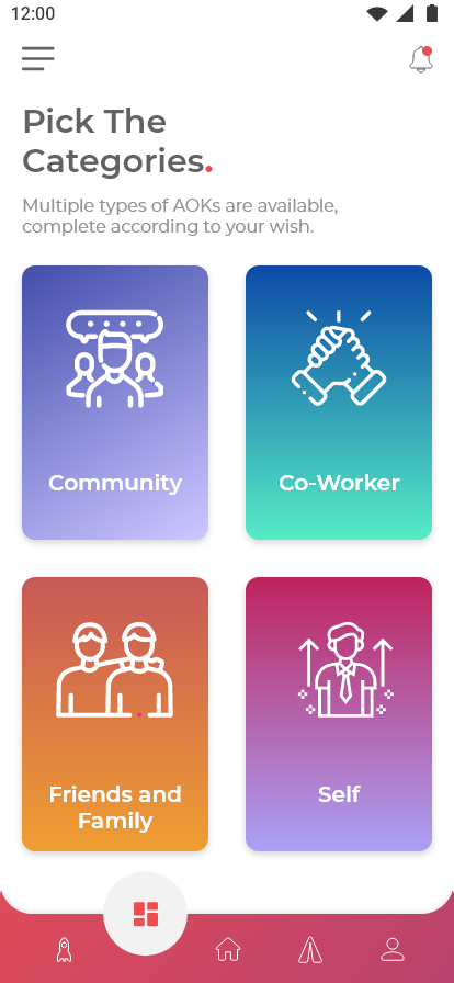
Bottom Navigation
If you use WhatsApp on iPhone, you can simply experience the bottom navigation pattern. It gives a unique look to your app and makes it more accessible. Accessible in the sense of clicking an icon or option in less time as it is near your thumb.
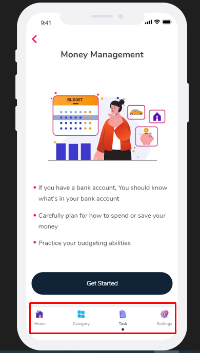
When using a cellphone, we tend to use our thumbs the most; bottom navigation is where your thumb may be the most useful. You can get precisely where you want to be with a few touches; there is no intricacy. It’s rather well-liked because of this function!
Sidebar Navigation
Sidebar navigation gives the feel of the directory. Like you see the sidebar menu and select the category where you want to go. Sidebar navigation also has more space that observes categories or sub-categories in it.
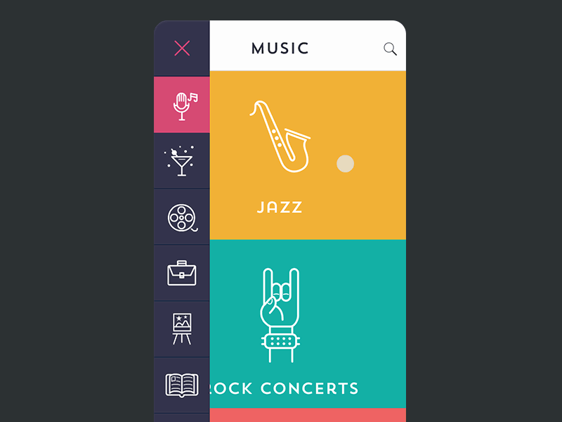
When you analyze the use of a sidebar navigation pattern, there are lots more to have. Using this mobile app navigation pattern, you may encourage visitors to explore certain categories by giving the icons enough room to be correctly presented without detracting from the aesthetic attractiveness of the design.
By positioning the CTAs, you can exploit this pattern to your full advantage and influence visitors to click on it.
Floating Navigation Button
If you want to make your users curious, then the floating Navigation button is the right choice for the mobile app user interface. The floating action button, also called FAB, takes up a small space on the screen, but it is an attention-grabbing navigation button that anyone wants to see.
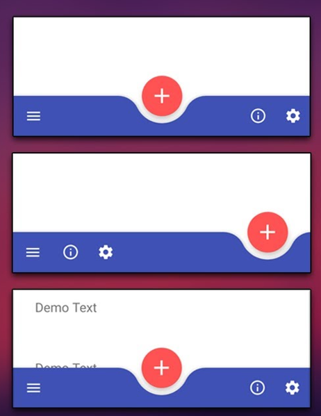
FAB gives the personalized navigation button that navigates impersonally. It looks like a small-circled button (which may or may not include content or any symbol) that does not indicate what’s in it. After the users click the button, they can navigate from where they want.
The mobile app navigation clearly defines the power of distraction by just placing a symbol like a button without limiting the function. It may be difficult for users to identify what’s in it, but curiosity can help them to perform their desired action.
Gesture-Based Navigation
As far as designing trends are changing, mobile app navigation also gets traction related to new trends. Gesture-based navigation is one of them. Although it is not a new element, you can say after high usage of touch-screen mobile, gesture-based navigation is also an overhaul guide to navigate.
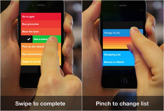
It basically gives the swipe experience that we use nowadays more frequently in Facebook and Instagram stories. It allows swiping up in a different direction to go further. Gesture-based navigation stands out from the rest since it is very practical for users to utilize. Users are already quite accustomed to this UI design pattern; more testing is just necessary.
Sub Navigation
Subnavigation is the user interface for the site’s navigation that enables users to access lower-level categories (IA). Sub navigation is one of the most common mobile app navigation patterns when the app has subcategories and sub-sections.
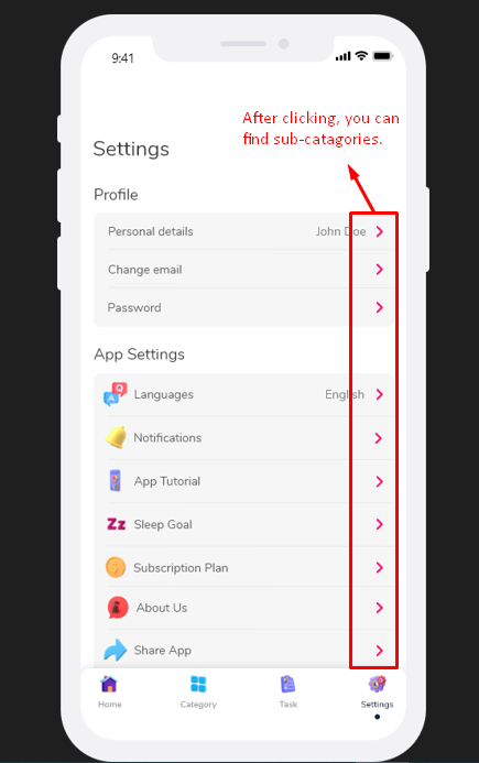
It would be great if UI UX designers consider this option to make UI UX design lightweight and organized. The simplicity in mobile app navigation would lucidly classify mobile app features.
Read More: 7 Unforgettable Reasons For Exceptional UI UX Design For Mobile Apps
Grid Mobile App Navigation
While using grid navigation, mobile app designers give a multitude of options in just sliding one by one category. You have to make every grid more attractive than differentiating categories.
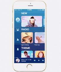
You must be careful with the typefaces and color schemes in this navigation pattern since customers may now browse across several categories at once. You can find other mobile app navigation patterns, such as voice search, search-based navigation, or card navigation. These are the new yet most used apps that look modernized.
Voice Search Mobile App Navigation
Voice searches are the next big trend in the mobile application development industry. People are very keen to add futuristic elements to make apps unique, eloquent, and user-friendly. Voice search allows users to speak of what they want, bringing all possible actions right in front of users.
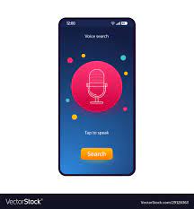
Then, finding anything in that app is a piece of cake for them since all they have to do is “talk,” and the app will show it to them. Navigation menus, tabs, or buttons are not necessary.
Search-Based Navigation Pattern
When we talk about search-based mobile app navigation, we all experience it while using apps. You have to write it and click a search button that is more convenient to provide the best search results.
You’ll notice a significant difference if the search bar is working properly. Why not use a search bar if that is all that is required to see a noticeable increase in the finding?
So, What Navigation Will you Need For Your App?
With the pile of options in mobile app navigation, what you should consider is more difficult. We have seen how important it is to navigate mobile apps by considering yourself a first app user. While building an app, you have to consider users’ convenience. It would be as simple as every first user can easily operate without any hurdle.
Although mobile app navigation is a game changer when connecting one point to another, navigation is all you need while designing an app prototype. So, be careful while selecting the Navigation bar, or you can consult experienced and professional UI UX designers to guide you about your app design.
You don’t look further to find proficient mobile app designers when MMCGBL provides you with all services. No matter if you want UI UX design services or a complete package of mobile app development services, we are all set to start your project.
What we can do must be your next question; let’s schedule a call for a chit-chat on it.