Dark Mode Theme – 8 Ways More Effective For Mobile App UI UX Design


Designing gives life and becomes an artistic picture of any basic and dull infrastructure. The inventive trends make designing more impactful and appealing. These trends are not rocket science, but simple elements make applications UI UX design more powerful.
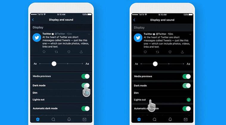
One of the mobile app designing trends that we are going to explain is nothing but a dark mode theme which is the new fashion but very effective for people’s eyes. This attention-grabbing dark mode theme trend you can see in the most-used apps such as Facebook, Twitter, WhatsApp, etc.

Over the past few years, the most often sought elements in app design have been dark themes. At the Google I/O 2019 Conference, Google announced the general adoption of the Dark Theme, which was first introduced on macOS last year. Dark themes used to be uncommon but are now the newest styles and are pervasive.
Dark themes may be quite advantageous when used properly. In low light, they are easier to read. They lessen eye fatigue. Based on the screen, they can significantly reduce battery use.
It’s extremely vital for a UI UX designer to prepare the Dark Theme for his app. However, creating a beautiful dark theme is difficult. Colors cannot simply be repeated, nor can shades be reversed. You will obtain the opposite of what you need if you do.
Inadequate dark mode design causes eye fatigue and makes it more challenging to see in low light. The dark theme has become a significant UI component for both Google and Apple. The intense brightness of this theme provides security in a gloomy setting. Therefore, while creating gloomy themes, be careful to make them fun, harmonious, and readable.
Read More: How UI UX Design Helps to Build a Website or an App
Why Do We Use Dark Mode Theme For Mobile Apps?
The dark mode theme currently works on almost every gadget, such as smartphones, laptops, and tabs. It is not about mobile apps but about the UI UX design of mobile apps that makes them consistent and more attractive.
It entails that a lighter text (white or gray) is shown against a dark or black screen rather than the standard dark text appearing against a light screen (known as “light mode”). However, the majority of phones and applications come with a light mode set as the default.
Apart from the default settings, you can customize your theme by adjusting the dark mode options. You may find it as a black model, dark theme, night mode, light on dark, etc.
The dark mode is designed to cut down on the amount of brightness that device screens produce while keeping the minimal color intensity ratios necessary for legibility.
Dark settings are available across the board on Android app development and iOS app development. You will still need to configure dark mode on some specific applications, though.
Both OS requires professionalism to embed the dark mode theme rightly. The recent changes we have observed in Apple iOS 13 to design dark mode theme introduces:
- Nine predefined system Colors.
- Semantic colors for usually implemented UI components.
- It also provides over 1500 SF symbols for app designers and developers.
- Introduced eight vibrancy effects and four blur effects with iOS 13.
You may set up dark mode on your desktop or laptop using some PC operating systems. So here’s the crucial query: Is it time to join the dark theme?
What Justifies Choosing Dark Mode?
A few reasons that make the dark mode theme essential for mobile apps are worth mentioning to elaborate on why UI UX designers should opt for dark mode themes.
Because It is a Trend
When you walk with the trends, you adapt to market competitive challenges. The dark mode theme is the sought-after trend that UI UX designers adequately adopt to make the design more exciting.
81.9 percent of 2,500 Android users surveyed by Android Authority utilize Dark Mode on their phones, in applications, and anywhere else it’s accessible. 9.9% of respondents claimed to alternate between dark and light modes.
As a result, 91.8 percent of respondents utilize a dark mode on their devices in some capacity. 8.2 percent of people just claimed not to utilize dark mode.
Sustain Battery-Life
An application’s dark mode conserves battery life which is a huge benefit for mobile users. People struggle with low batteries while using apps, which could be the returning point of apps that gives sufficient battery timings. Google verified that the dark mode works very well on OLED panels for extending battery life.
OLED (organic light-emitting diode) screens are most commonly seen in smartphones released after 2017. This sort of screen uses less electricity to display dark-colored pixels since it lacks a backlight, unlike LCD (liquid crystal display) panels on previous phones. OLED displays also enable nanosheets and stretchy and foldable phone panels.
Purdue researchers discovered that, on average, moving from light mode to dark mode for many different OLED smartphones only saves 3 percent to 9 percent power at 30 percent to 50 percent brightness.
Eye-Sight Protection From Screen
Apps with excessive brightness might damage your eyes over time if used often. The advantages of the dark mode are now here. Your eyes will become more at ease if you keep them open while working in the dark to solve these health and wellbeing issues.
How to Effectively Design a Dark Mode UI UX for Mobile App
Google and Apple have concentrated on their dark mode design guidelines to provide a healthy UI experience. However, as we already noted, ignoring the dark mode design motif might lead to a subpar experience.
Therefore, to efficiently develop dark mode for mobile apps, you must abide by the advice provided below:
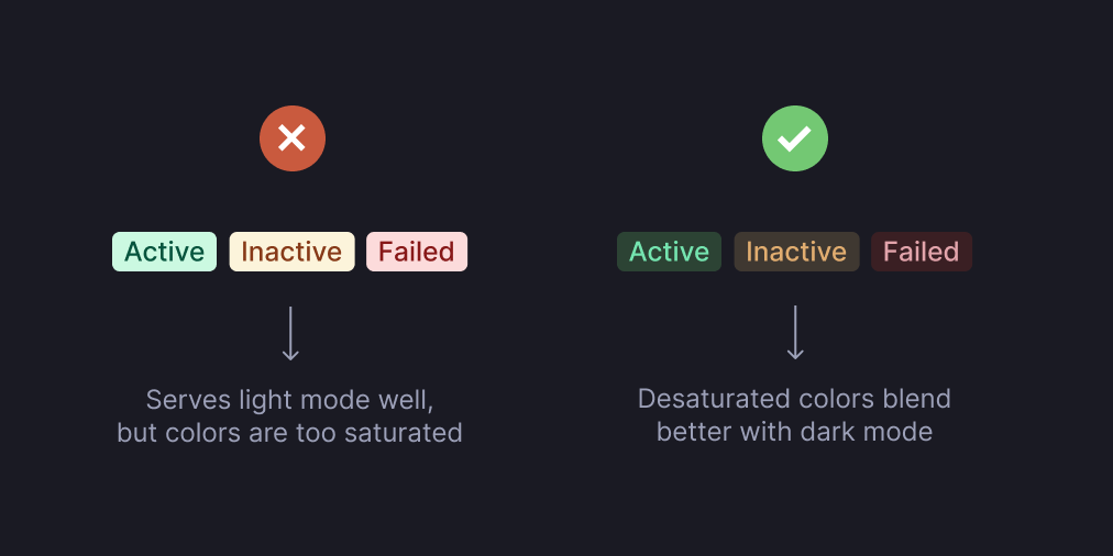
Stay Away From Saturated Colors
Even though rich colors appear beautiful on bright backgrounds, they can visibly bounce against dark backgrounds and make text harder to read. De-saturate the primary colors in order to create a good contrast with the black surface.
Use lighter colors (those in the 200–50 range) since they are easier to read on surfaces with dark backgrounds. Lighter shades will preserve meaningful differences without annoying your eyes, but they won’t make your app’s user interface less expressive.

Darken Distant Surfaces
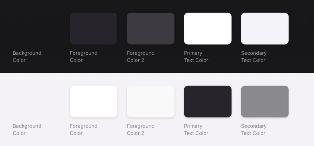
The backdrop colors used in dark themes for UI components stick to the concept that the surface area of an element gets lighter as it gets closer to the user. In this model, an ambiance-like light source is thrown downward from above. The layer receives less light and blends into the backdrop more if it is farther away.
The designer could be persuaded to create a dark theme by flipping the current light theme. But nearby surfaces would turn dark, and further ones would turn bright. It would seem unnatural since it would violate physics.
Instead, stick to using the main surface color of your light theme. The primary surface color for your dark theme is then created by flipping the color. This color should now be dark for far-off surfaces and light for nearby surfaces.
Look For the Emotional Side of Your App
It’s likely that your goal while creating a dark theme for your app will be to convey the same emotional feeling that your light theme design shared.
But doing so is foolish. Since various hues eventually conjure up multiple feelings. Your dark mode colors will consequently elicit a distinct emotion. For each theme UIs, it is important to have a shared emotive set.
Reduce The Use of Bold Colors in Major Blocks
Large blocks of vibrant color are occasionally used in light themes. Although this is often acceptable, our most essential elements are set to become clearer.
Dark themes are an exception because the vast blocks of vivid color draw the eye to all necessary components more effectively.
Avoid Applying Pure Black as a Color
It is confined to using white text on a black backdrop in a dark theme. In fact, staring at a high-contrast screen might be challenging. Your app’s dark theme shouldn’t have all-white text on a black backdrop. Exploring a screen with a lot of contrast might be tough.
When adding the dark mode to your application, opt for dark gray as the primary color for the dark mode components. Dark gray is a safe choice since it eases eye strain and makes it simpler to look at shadows on a surface than black does.

Examine The Design in Both Versions
Testing your app in both dark and light mode is a must. Your SQA team would confirm the end result of the modes by testing as end-users. They need to test the app twice a day to check how it performs in various lighting settings.
Just as your users would switch between the two theme UIs at various times of the day, your app must be readable, well-functioning, and deliver user-friendly interfaces to ensure it satisfies users’ requirements.
Allow User To Switch Modes Periodically
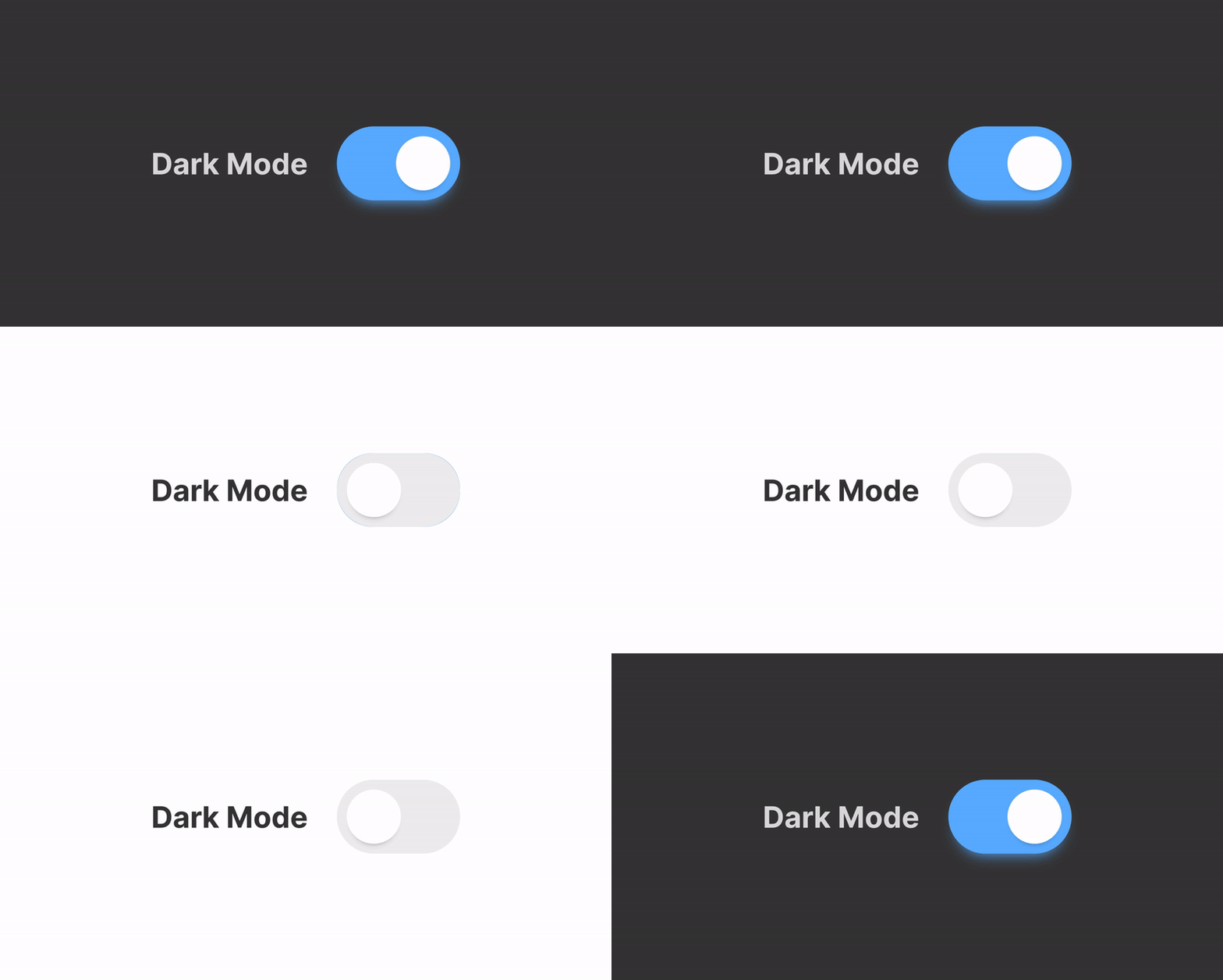
Isn’t it thrilling to give the system control over when to activate or deactivate the dark theme? The app shouldn’t enable a dark theme automatically. Allow users to use UI controls to switch between the standard theme and the dark mode.
Users must be able to manually select the mode depending on their needs. Mode changer placement and design should be considered meaningful. However, this choice may also lead to a bad user experience. After all, doing so enables you to assume authority over people and delegate decision-making to the computer system.

Associate Dark Theme With Graphics
You must prepare for the dark theme’s deployment if your app has animations or a lot of graphic components. It would be smart to completely desaturate those hues to assist the viewer’s focus on the subject if the artwork has both a subject and a backdrop.
Read More: Mobile App UI UX Design: Trends for 2022
Advantages & Disadvantages Of Dark Mode Theme
Advantages:
- Dark mode nevertheless makes your eyes squinch and the person beside you. Dark mode interfaces are less botherless.
- If you use your phone before night, less “blue light,” which might keep you awake, will be released.
- It is reported that the dark mode theme in mobile apps can help to save battery life.
- It can possibly lessen dry eyes and eye fatigue in low-light situations.
- According to some experts, the dark mode might benefit those who are light sensitive or have vision problems.
Disadvantage:
- Only an OLED screen can refrain your battery from getting low. If you have old LED-type screens, it will not impact your battery life.
- Contrasting light and dark are not always healthier for the eyes because text’s washed-out appearance might worsen eye strain.
- Long passages of text or information might be difficult to read in dark mode.
- Light lettering on a dark backdrop might be challenging to read in a brightly lit space.
Ending Lines
Although, for UI UX design, these tiny elements are worth it the most when compared to the development task. These features evolve the designs of mobile apps that ultimately affect app users and downloads.
Moreover, the dark mode theme is rightly used for making eyes protective and supporting the longest screen timings for users. Let’s add this feature to your list if you are going to make your app.
Asking designers to make possible options to execute your app, you must know first about multiple features influencing users’ usage timings. If you can do this, hire the best UI UX design team like MMCGBL, who can help you guide every step of building robust and exciting mobile apps. Their vast portfolio caters to every industry and every web and mobile app development such as gaming apps, AI & ML-based apps, or, you can say, every kind of mobile app.
Dark Mode themes are challenging to execute, though effectively. The simple technique of flipping hues and repeating colors will increase eye strain, make reading more challenging in low light, and even cause data and visual structure to become broken. Let’s hire professionals to take it a step further.


